Homepage Widgets

Homepage
Widgets

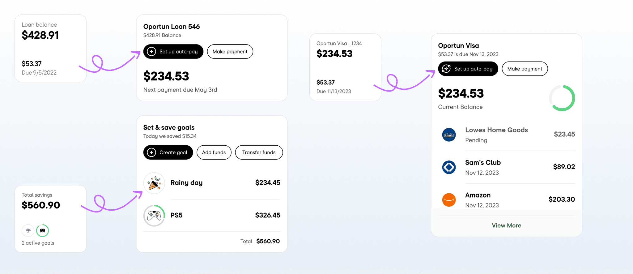
Displaying the right amount of timely, relevant information about your financial accounts and status so members can take quick actions to manage their account(s).

Role

Lead Product Designer

Teammates

Amy Ha

John Quaresma

Byron Montero

Tools

Figma, Figjam

Timeline

Q1 2021

Description

Building financial account snapshots with quick actions to make managing your financial accounts inside of Oportun quickly and easily.

Context

The current app iA wasn't working for our members, the app had recently been redesigned, the product areas had been built into silos to prioritize the speed to get to market and had not taken account of years of learning teams had made to get to where we were. So everyday actions became buried inside sub-pages, 🔑 insights that our members had grown used had been removed from the app

Intro

Members were struggling to find important information about their account and status of their accounts. This had lead to a lowered member sentiment towards their membership and was leading towards a significant decrease to retention metrics.

Problem

Earlier this year the app had just gone though a huge rebrand, we had changed the name of the app from Digit to Oportun our parent company. Along side this rebrand there was also redesign of the entire app which also added the product offering of Oportun (loans & credit cards) merged our and had received a lot top down direction from the executive team.

The business wanted to bring back their retention rate and member lifetime rate to what it was historically, improve new 30-90 day retention and increase member sentiment towards the company.

Current flows made accessing information and performing actions difficult

Goals

  • Increase baseline metrics for Save, Loans and Credit card.

  • Reduce churn that had occurred from

  • Move away from " feature ads" to contextual prompts to adopt new features

  • Create spaces for financial insights

  • Create a baseline for future iterations. What was existing

What we knew

We had reframed our product offering for the first ten years we had been a service that you connected to your bank account and we facilitated in your savings. That was the mental model our users had for the product. We rebranded that into a savings account that we were charging $5 a month to run. We had removed almost all signalling to their actual goals and instead focused on what was in their "account."

Data: We were experiencing a high level of churn for our members of multiple years. We had started to see a high disparity in our referral numbers and app store ratings.

Heuristics evaluation: Lack of system status of what was most important for our members, all important actions were buried inside sub flows.

Challenges & Opportunities

Project challenges

Resistance from executives: After being identified as the leading savings app of 2023 by Bankrate and several other platforms, a contingent believed there was no requirement for alteration.

Uniformity across product teams: We did not own the the product area. Instead, the stakeholders in the product arena had the final voice in deciding whether we shipped an update for them

Narrow range for the initial assignment

Hypothesis

  1. Introducing product actions to the would increase savings, loan payoff rate and other core product actions and would also re-build trust with our long term members.

  2. Increasing and improving our just in time system statuses would help us retain new members because they would be able to see successs sooner.

  3. By moving actions to the home page we would be able to begin to build it into a member's finical insights hub a tool that we could then use to activate the member into new product spaces.

The Process

Testing & Improving Core Flows

We started off running a pretty basic test a/b. With the loans team I convinced them to funnel a percentage of their traffic directly to a page that allowed the member to pay their loan or set up auto-pay that also housed some other loan information.

The test was quick win, we saw that members were 2-3x more likely to set up auto-pay or pay their bill on time when compared with the home screen.

Getting project buy in

A large portion of this project was selling and reselling this project across the company. By collaborating with Designers and PMs We were quickly able to grow vocal majority of product members advocating for the launch of this product.

Built into design system

Frameworks & Refinements

As I designed out each of the product area's widget's I collaborated closely with the teams that I would be handing them over to, because they had more domain knowledge, would be closer impacted by the results of the launch, and would be responsible for iterating on the design in the future. To maintain quality and similar experiences across products I created frameworks for building and principles of use to maintain unifomity.

Launching

With the confidence from our multiple tests, general member feedback we launched to a small percentage of our audience and observed how and if this new experience impacted our members, our metrics

Tryout the prototype

Savings

Tryout the prototype

Savings activation

Refinements and building additional experiences

We slowly released the experience to the rest of the user base making adjustments to component's, added in a widget for credit cards and used the framework we created to launch a new empty state 1st time use experience to the site.

For further results, questions about what was built please reach out to me at work@alandangerfield.com